RACHEL UFFNER
OVERVIEW
The primary goal of the new website was to improve the functionality across devices and to enhance the visual appeal. The updated site is fluid and has a strong use of bold serif fonts that are cohesive to the gallery's brand. These elements are designed to evoke a lively atmosphere while creating a captivating and memorable experience for any visitor.
INVOLVEMENT
• Lead Designer
• Front-end Development
• Collaborated with Engineering and Product Teams
• Aligned with Senior Leadership and Stakeholders
HOMEPAGE
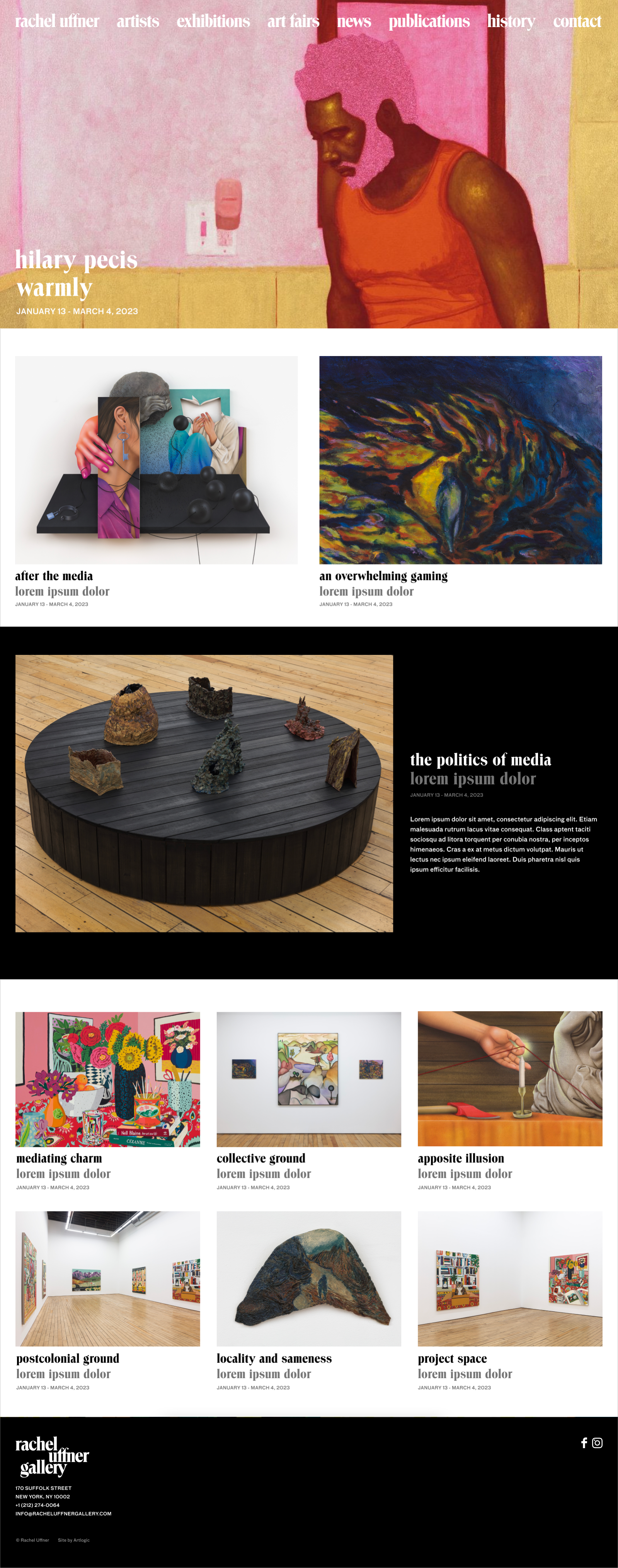
DYNAMIC LAYOUT
Creating a dynamic homepage featuring larger images and curatorial options has significantly boosted user engagement. The enhanced visual appeal and improved navigation encourage visitors to explore more content, leading to increased time spent on the site and higher interaction rates with the new features.
ARTISTS PAGE
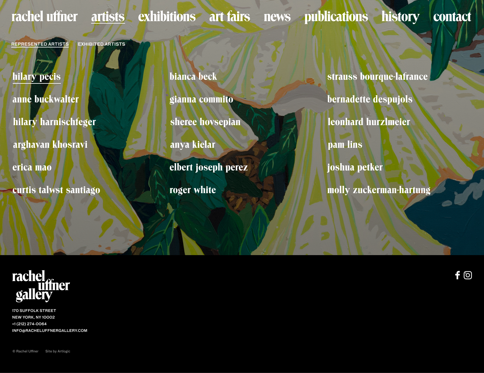
SIMPLE INTERACTIVITY
Most galleries maintain long lists of artists they showcase, but Rachel Uffner Gallery, a long-standing presence in the art world, takes a different approach. With a carefully curated roster of artists, we can shift the focus from the names to their beautiful imagery by applying a simple rollover which reveals a full bleed image.
HISTORY PAGE
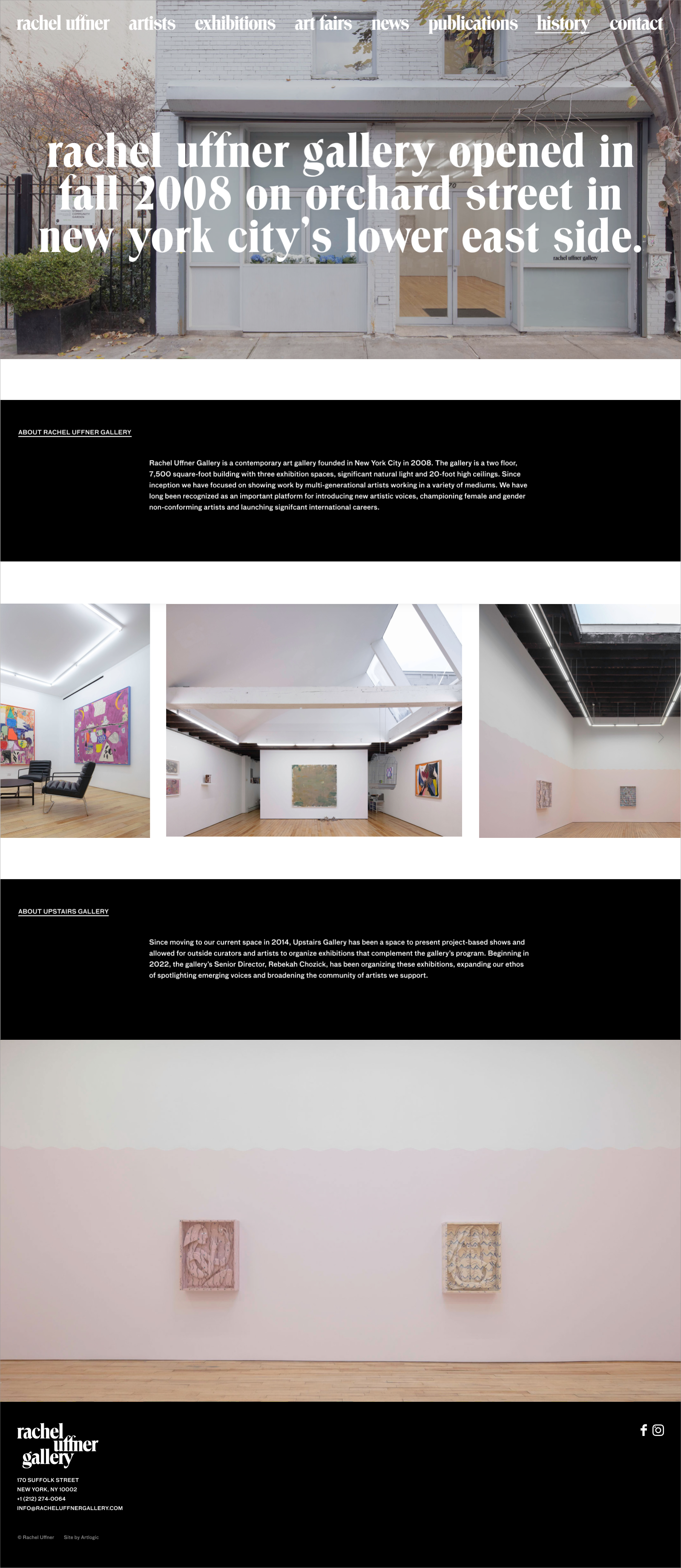
BOLD TYPOGRAPHY
The typeface Troover represents Rachel Uffner's broader objectives for their new site by delivering a contemporary, bold, and clean aesthetic. By integrating Groover, the website not only aligns with the gallery's sophisticated brand identity but also ensures a seamless and engaging user experience.