OVERVIEW
As part of a small but mighty design team, I played a pivotal role in reimagining all user-facing touchpoints, including landing pages, e-commerce, CTAs, responsive design, and performance optimization.
My contributions spanned the entire design and development process, including user research, ideation, wireframing, visual design, user testing, and front-end development using Sass, HTML, JavaScript, and Git.
IMPACT
The previous site was outdated and lacked e-commerce capabilities. The redesign introduced a fully scalable site with a new shop section that significantly drives sales and revenue growth.
Additionally, we enhanced the overall design to align with the brand identity, boosting engagement and creating a more cohesive user journey.
INVOLVEMENT
Lead Designer
Front-end Development
Collaborated with Engineering and Product Teams
Aligned with Senior Leadership and Stakeholders

E-COMMERCE
Partnering with product and engineering teams, we are now able to keep the entire transaction within the new shop to ensure a consistent user experience, which has translated into tangible financial gains for the gallery.
Based on our research, avoiding redirects to third-party payment pages is crucial, as 58% of consumers will abandon a purchase if the payment process is complicated.

RESPONSIVE DESIGN
By taking a mobile-first approach, I ensured that users on smaller screens have an optimized experience while creating a scalable design. Focusing on mobile-first allowed me to address constraints like screen size and bandwidth early, resulting in simpler, faster, and more efficient solutions across all platforms.

PERFORMANCE OPTIMIZATION
Implementing AJAX requests for dynamic content loading was essential in preventing information overload and maintaining a seamless user experience. This approach has reduced page load time by 40%, which is especially important for our mobile users on varying network conditions.
NEW FEATURE / WCAG AAA STANDARDS
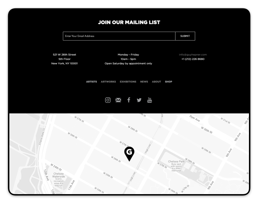
Collaborating with the Engineering Lead, we successfully built an interactive map into the existing codebase using a third-party solution.
Additionally, the footer was updated with a more subdued color scheme, enhancing the overall aesthetic and aligning with the gallery’s branding, while ensuring all color combinations meet WCAG AAA standards.
IDEATION
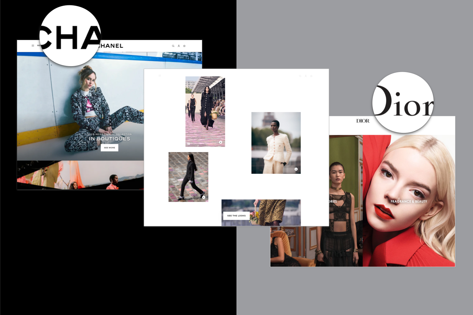
SITE MAP
Following the initial kick-off meeting to assess the client's needs, I mapped out the full user journey. The primary focus was streamlining the checkout process, which I reduced from 7 steps to 3 through multiple iterations:
1. Cart review (with edit capabilities)
2. Shipping and payment info
3. Order confirmation
Key Features:
- Integrated a 'buy now' button for single item purchases
- Added progress indicators to provide context within the flow
TYPOGRAPHY ITERATIONS
I explored visual directions through moodboards to determine font styles that aligned with the brand. The ideation phase featured a workshop with team members to review and refine early concepts. “Version 2” emerged as the frontrunner for its readability and high-end fashion influence. We established a typographic hierarchy with three text styles for consistency.
I then gathered feedback from key stakeholders to ensure alignment before moving forward with creating mockups.
RESEARCH
USABILITY TESTING
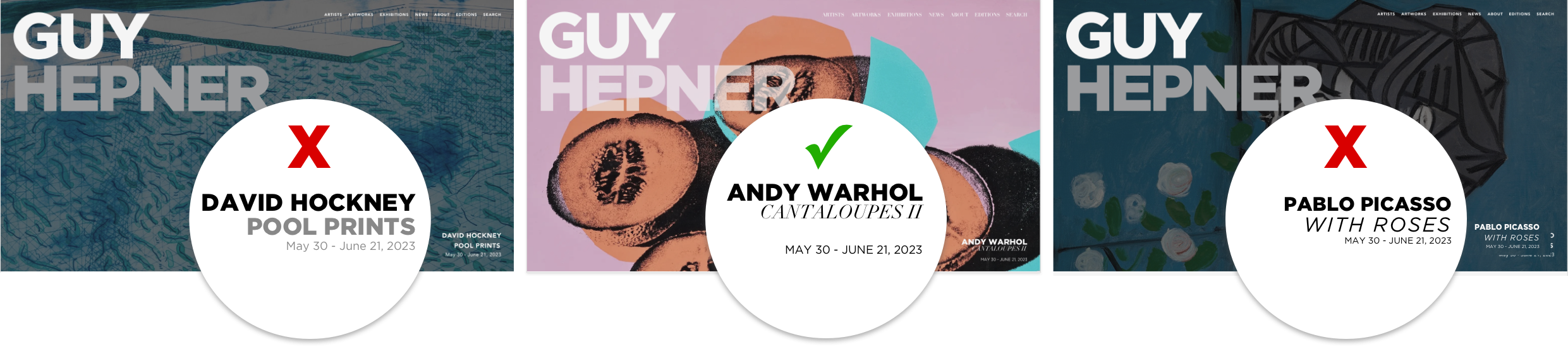
Key A/B tests were conducted to understand if the new designs improved the categorization of a large artwork collection.
I created clickable prototypes and led usability testing, identifying both advantages and challenges. Based on the valuable feedback “strategy one” was implemented.
To mitigate visual overload in this strategy, we limited the number of displayed images and added a “view more” button, allowing users to load additional content as needed.
STRATEGY ONE
Displaying all thumbnails with links at the top to sort
• Quick Navigation: Users can easily jump to a specific category by clicking on the links at the top.
• Visual Overload: Having too many thumbnails displayed at once can overwhelm users, making it difficult for them to focus on individual artworks.
STRATEGY TWO
Large thumbnails with associated thumbnails revealed upon click
• Controlled Exploration: Users may prefer clicking through and exploring the collection in a linear fashion.
• Limited Overview: Users may not be able to quickly gauge the diversity of the collection without an initial broad view.

DESIGN
BEFORE & AFTER
OLD VERSION OF THE ‘ARTISTS’ PAGE

OLD VERSION OF THE ‘SHOP’ PAGE
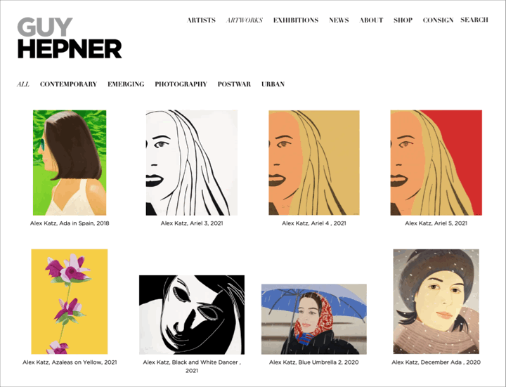
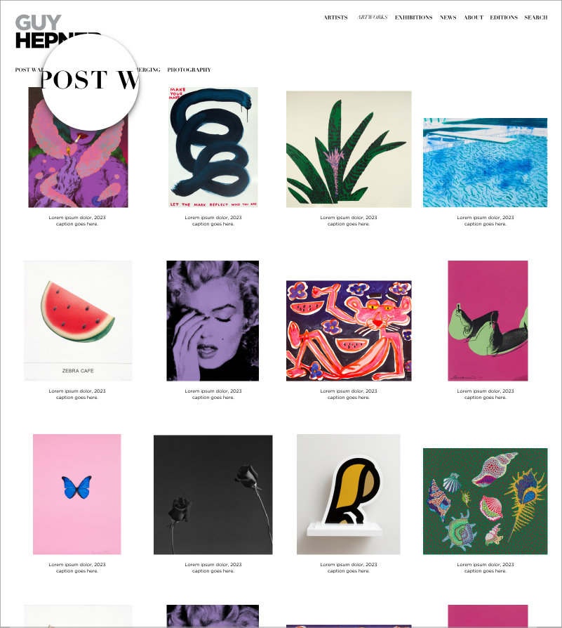
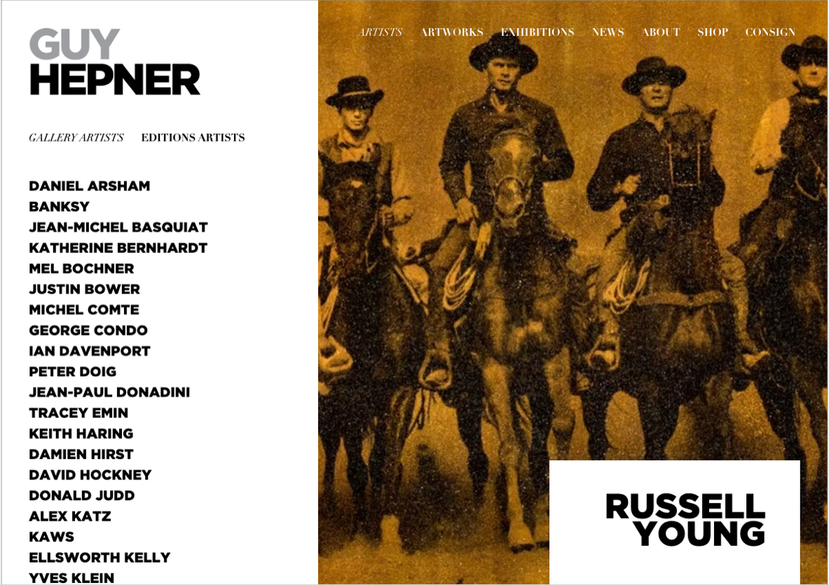
NEW VERSION OF THE ‘ARTISTS’ PAGE
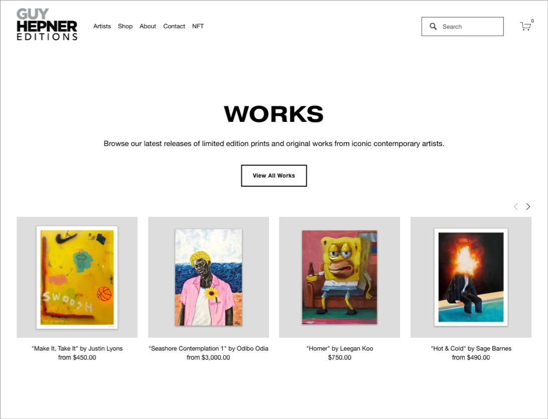
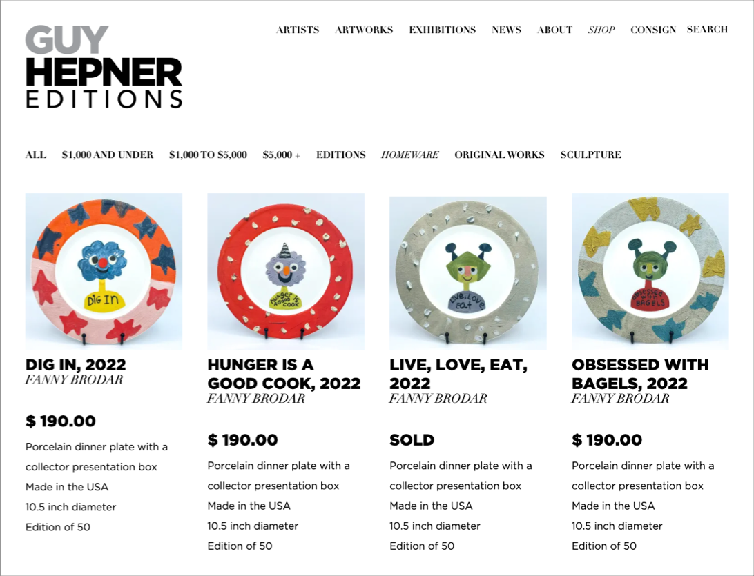
NEW VERSION OF THE ‘SHOP’ PAGE
DEVELOPMENT
STYLEGUIDES
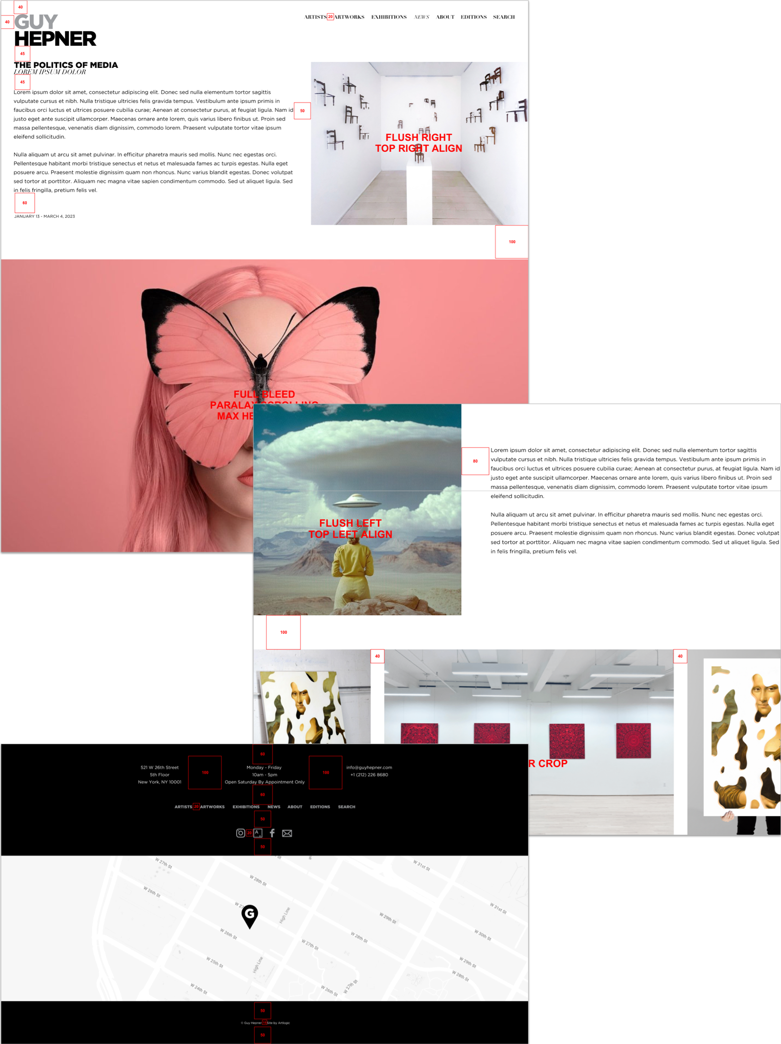
Once the design was finalized, I created style guides in Figma using components and auto layout. These guides include annotations, text notes, and measurements that automatically adjust with any design changes.
This serves as a valuable reference for designers, developers, and other stakeholders involved in both the creation and maintenance of the site.
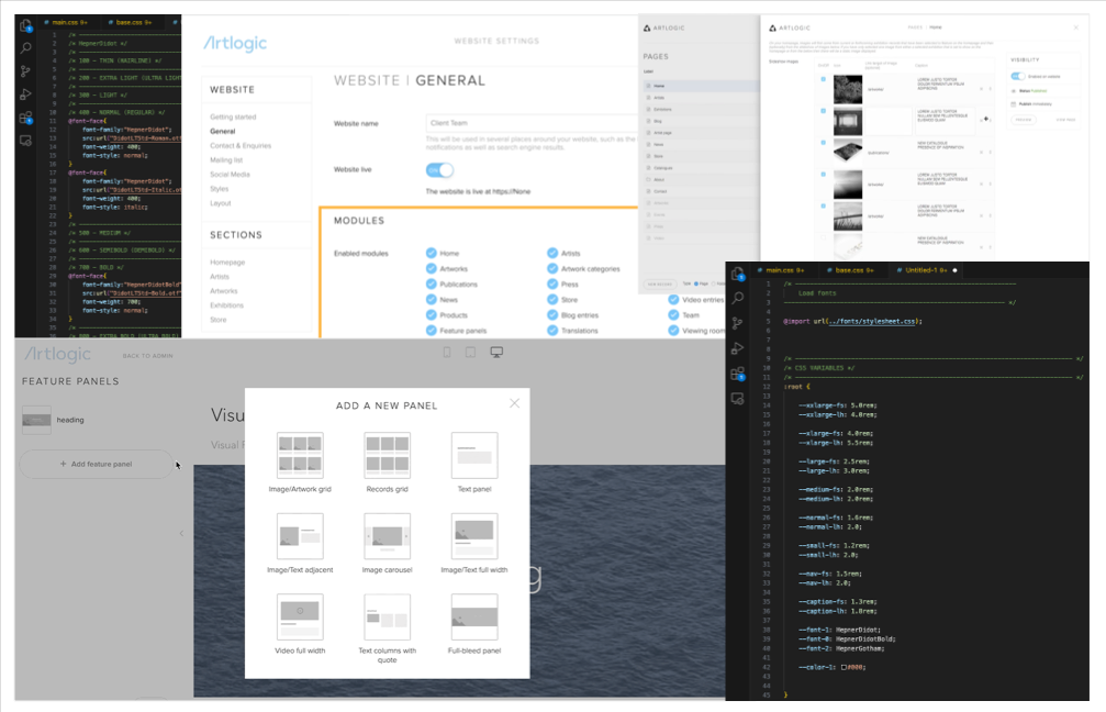
WORKFLOW
Based on the sitemap, I can determine the best approach for developing the custom admin for the client. This is preformed using a proprietary platform that encompasses diverse modules with varied functionalities for different content types. For each module, I have the flexibility to customize the design using CSS and JavaScript. The code itself is written within Visual Studio Code and undergoes processing/management through a Git workflow.